
Introduction:
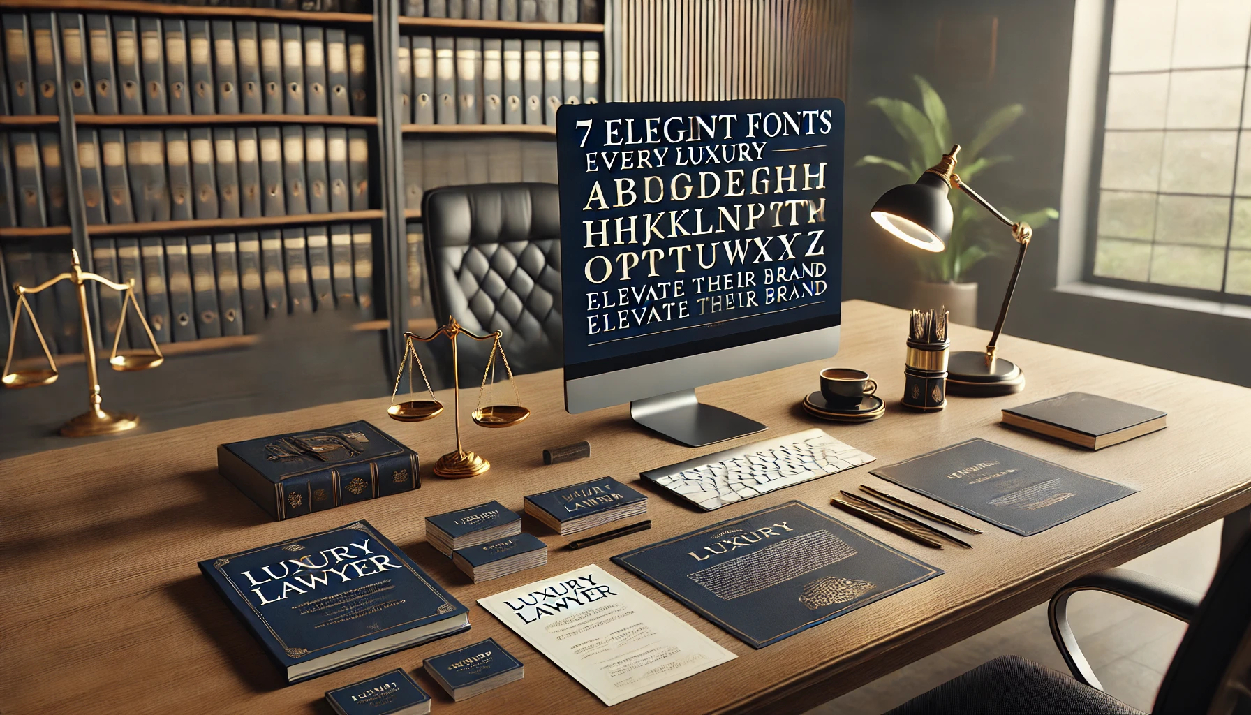
In the world of high-end law, every detail speaks volumes, and fonts are no exception. From the logo on your business card to the text on your website, the right fonts for luxury lawyer can elevate your firm’s image, conveying professionalism, elegance, and sophistication. When a potential client first interacts with your brand, whether through a sleek brochure or a well-designed website, the choice of font plays a silent but impactful role. In this article, we’ll explore how a carefully selected font can help create a lasting impression that sets your firm apart, ensuring that every detail aligns with your luxury law brand.
1. Why Font Choice Matters for a Luxury Lawyer
When it comes to luxury lawyers, first impressions are everything. High-end clients expect every element of a law firm to exude trustworthiness and exclusivity, and font choice plays a crucial role in creating that impression. A luxury law firm should radiate authority and professionalism the moment someone views its branding, whether that’s a business card, letterhead, or website.
The fonts you choose reflect the quality and caliber of your services, just as much as the words you use. A well-selected font conveys confidence, seriousness, and a deep understanding of the refined tastes of your clients. A simple font can feel underwhelming or unprofessional, while a luxurious font adds that touch of sophistication that high-end clients seek. In a competitive field, choosing the right font is not just about style— it’s about telling clients, “You can trust us with the most important legal matters in your life.”
By selecting fonts that align with prestige, lawyers specializing in high-end clientele can set the tone for a strong, reliable relationship from the very first glance.
2. Characteristics of Fonts for Luxury Lawyers
Fonts for luxury lawyers must capture the essence of prestige and refinement, and they do so by embodying specific characteristics. When selecting fonts, it’s essential to ensure they reflect the dignity and exclusivity that your clients expect. Here are the key characteristics that make a font suitable for luxury law firms:
- Elegance and Simplicity: The most effective fonts for luxury law firms are minimalist yet elegant. They avoid flashy or overly decorative styles, instead focusing on clean lines and subtle sophistication. This simplicity ensures that the design feels high-class, not overwhelming. A clear, straightforward font gives a sense of calm and control, two qualities clients seek in legal services.
- Serif Fonts: Serif fonts are timeless and classic, often used by prestigious institutions and high-end brands. The small strokes at the ends of letters, known as serifs, add a touch of tradition and authority. They communicate stability and reliability, which are vital traits for any lawyer dealing with high-profile clients.
- Timelessness: A font for luxury lawyers should be timeless, meaning it shouldn’t be trendy or easily dated. Clients looking for premium legal services want to see that their lawyer’s branding feels as relevant and trusted now as it will in the future. This means choosing fonts that blend modernity with a sense of tradition, standing the test of time without feeling outdated.
By focusing on these characteristics, luxury law firms can project an image that resonates with the high standards of their clientele while maintaining a timeless appeal.
3. Top Fonts for Luxury Lawyers
Choosing the right fonts for luxury lawyers is about creating a visual identity that aligns with the prestige and authority of the legal profession. Each font carries its unique blend of elegance, tradition, and sophistication. Here are five carefully selected fonts that perfectly embody the spirit of a luxury law brand:
- Bodoni: Bodoni is the epitome of luxury and modernity. Its high contrast between thick and thin strokes instantly captures attention and exudes a sense of timelessness. It’s a favorite for luxury brands because it speaks of both refinement and innovation. For a law firm wanting to project prestige while staying contemporary, Bodoni is an excellent choice.
- Garamond: Garamond is known for its classic appeal and high readability, making it ideal for long-established law firms that want to emphasize tradition and reliability. Its smooth, elegant curves feel both comfortable and authoritative, which can give clients a sense of trust and confidence in your firm’s experience.
- Didot: With its sharp edges and bold contrasts, Didot brings an air of sophistication and regality to any brand. This font’s polished and clean design makes it a standout choice for firms offering high-end legal services. It speaks to the exclusivity and refined taste of your clientele, ensuring your firm is seen as the pinnacle of elegance.
- Trajan: Trajan has long been associated with powerful institutions and reflects a sense of legacy and authority. Its timeless design draws from the classic inscriptions of Roman monuments, symbolizing endurance and trust. For a luxury law firm aiming to convey strength and prestige, Trajan is an ideal match.
- Playfair Display: Playfair Display strikes a perfect balance between boldness and approachability. Its high contrast and bold serifs create a look that’s both prestigious and inviting. This versatility makes Playfair Display an excellent choice for firms that want to project an image of high-end professionalism while remaining relatable to their clients.
Selecting any of these fonts can help your law firm create a luxury brand identity that resonates with high-end clients, ensuring that your image is one of prestige, trust, and timeless elegance.
4. Emotional Impact of Fonts in Law Firm Branding
The emotions evoked by a font are just as important as its appearance when it comes to branding a luxury law firm. The right font can subtly communicate trust, confidence, and reliability—all qualities that high-end clients seek in legal representation. Each font tells a story, and choosing one that aligns with the emotional tone you want to set is key.
- Bodoni: With its refined, high-contrast strokes, Bodoni conveys a sense of trust and security. Its balance of elegance and strength helps clients feel that they are in capable hands. The font’s clean, sophisticated look reassures clients that your firm will handle their cases with precision and care.
- Garamond: Garamond evokes a feeling of heritage and authority, ideal for law firms that want to project a sense of history and experience. Its classic design connects emotionally with clients who are looking for a lawyer that embodies tradition and proven expertise. It feels reliable, reassuring clients that they are working with a seasoned professional.
- Didot: Didot’s sharp contrasts and sophisticated appearance stir a sense of exclusivity and refinement. Clients encountering a firm that uses Didot will likely associate it with high-end service and attention to detail. It makes them feel like they’re choosing a law firm that is not only elegant but also thorough.
- Trajan: Trajan, with its roots in classical Roman inscriptions, creates an emotional connection to power and legacy. It stirs feelings of stability and permanence, making clients feel like they are choosing a firm that represents strength and durability in the legal world.
- Playfair Display: This font strikes a balance between prestige and approachability. Its bold serifs and modern design give a sense of confidence, while its welcoming feel makes clients believe the firm is both powerful and relatable. It can stir emotions of trust while still maintaining a friendly, approachable demeanor.
In the competitive world of luxury law, it’s crucial to choose a font that not only looks good but also stirs the right emotions in your clients, instilling confidence from the very first interaction. The font becomes an emotional bridge between your firm and your clients, fostering a sense of security, authority, and trust.
5. Combining Fonts for Maximum Impact
While a single font can anchor your luxury law brand, combining fonts strategically can amplify the overall effect, enhancing the feeling of sophistication and balance in your branding. The key is in harmony—pairing fonts that complement each other without competing for attention.
For instance, using a bold, regal serif like Didot for headings can command immediate attention, showcasing strength and elegance. To maintain a polished and clean look, pair it with a subtle sans-serif for body text. A sans-serif, like Helvetica or Montserrat, brings clarity and readability without overshadowing the primary font. This contrast helps the content remain luxurious yet approachable, giving clients an experience that feels both professional and accessible.
Another effective combination could involve using Trajan for your law firm’s logo or main titles. Its association with power and legacy sets a strong foundation. Paired with a more neutral font like Garamond for the rest of the branding materials, it creates an elegant, timeless feel, balancing the firm’s modern professionalism with a nod to tradition.
When combining fonts, ensure consistency across all marketing materials. Keep a cohesive balance between boldness and subtlety—too many font styles can create visual clutter. The goal is to craft a seamless visual identity that reflects the luxury and trust clients expect from your firm. Use these combinations across everything from web design to printed materials, ensuring a consistent, high-end look that captures attention and instills confidence.
The art of combining fonts lies in finding the right pairing to enhance the luxurious appeal while ensuring the overall design feels cohesive and balanced.
8 Powerful Ways a Financial Lawyer Can Protect Your Future and Secure Your Wealth
6. Font Color and Spacing for Luxury Lawyers
The visual impact of luxury fonts is not just about the font itself—color and spacing play a crucial role in creating a high-end aesthetic that appeals to prestigious clients. Pairing your luxury fonts with the right color scheme can dramatically enhance their elegance and professional appeal.
For luxury law firms, deep navy, black, and gold accents are popular choices. These colors convey trust, authority, and sophistication. Navy blue symbolizes stability and confidence, ideal for a law firm projecting professionalism. Black brings a sense of power and seriousness, while gold adds a touch of opulence and refinement. Together, these colors elevate the luxurious feel of your fonts, ensuring they leave a lasting impression.
In addition to color, spacing is essential for a polished, high-end look. Generous line spacing and ample margins give the text room to breathe, making the content easier to read while maintaining a clean, minimalist design. This use of white space prevents the page from feeling cluttered, allowing the font’s elegance to shine through. When the text is well-spaced, it adds to the luxury experience, ensuring clients feel at ease navigating your materials without feeling overwhelmed.
For a luxury lawyer, choosing the right color palette and spacing the text properly can transform even the simplest fonts into something that feels exclusive and high-class. By creating this balance, your law firm will project an image of professionalism and elegance, leaving clients with a sense of confidence in your services.
7. Common Mistakes to Avoid in Font Selection
Choosing the right fonts for luxury lawyers requires attention to detail, but there are common mistakes that can undermine the desired effect. Here are some pitfalls to avoid when selecting fonts for your law firm:
- Overly Decorative Fonts: While it might be tempting to choose ornate or decorative fonts to stand out, these can often distract from the professionalism and authority that clients expect from a luxury law firm. Ornate fonts may look stylish but can feel overly casual or cluttered, making it hard for clients to take your firm seriously. Always opt for fonts that are elegant yet simple, maintaining a balance of refinement without overcomplicating the design.
- Inconsistent Branding: Consistency is key in building a strong brand image. Using more than two or three fonts across your marketing materials can create visual confusion and diminish the sense of cohesion. Stick to a carefully selected font family and apply it consistently across all platforms—whether it’s your website, business cards, or brochures. This helps reinforce your firm’s identity and makes your brand instantly recognizable.
- Ignoring Legibility: No matter how beautiful a font may look, it’s essential to prioritize legibility. A font that’s hard to read can frustrate potential clients and detract from your message. Make sure that your chosen fonts are clear and easily readable, both in digital and print formats. This ensures that clients can effortlessly engage with your content, whether they’re browsing your website or reading a printed document.
By avoiding these common mistakes, you ensure that your luxury law firm maintains a brand that is both professional and visually appealing, helping to attract and retain high-end clients.
Conclusion
Choosing the right fonts for luxury lawyers is more than just a visual choice—it’s a strategic decision that shapes how your law firm is perceived. Fonts like Bodoni, Garamond, and Didot help convey the perfect blend of elegance, professionalism, and exclusivity that luxury clients expect. By carefully selecting fonts that stir the right emotions and align with your brand’s identity, your law firm will stand out in the competitive luxury market. Every detail, including font choice, contributes to building trust and confidence, setting your firm apart as the premier choice for high-end clients.
FAQs
What is the most professional font for lawyers?
Fonts like Garamond and Times New Roman are considered highly professional for lawyers due to their legibility and classic appeal.
What font do most luxury brands use?
Luxury brands often use fonts like Bodoni, Didot, and Trajan, known for their elegance and timeless sophistication.
What font looks most professional?
Serif fonts like Garamond and Georgia are commonly regarded as the most professional, offering a blend of traditional and modern appeal.
What is the best font for legal agreements?
For legal agreements, Times New Roman or Arial is often recommended due to their high legibility and clarity.
What font does the Supreme Court use?
The U.S. Supreme Court typically uses Century Schoolbook in its printed opinions, a font known for its formal and traditional appearance.
What is the most professional signature font?
Fonts like SignPainter or Great Vibes are ideal for creating a professional, yet elegant signature style that complements luxury branding.
Discover the Attorney realm with The Expert Law. Visit our website for endless inspiration!